The Building of a Wine Brand
Joie instantly became a cult media darling by creating a unique outdoor cooking school and throwing magical long-table dinners long before they were cool. The “content-heavy” and detail-oriented execution of the project was deep fodder for food and wine writers. Joie, in essence, was so multi-dimensional that it’s joyful energy pervaded every element of its growth over 20 years.
From the beginning, JoieFarm was a space to explore the potential of a new wine country cuisine in British Columbia and became a culinary destination from visitors around the world. The orchard-table menus dynamically explored and showcased this newfound regional cuisine while creating its place within the larger framework of cuisine found on the West Coast. The project grew, and a wine portfolio was created two years in.
The Joie wines, from their inception and throughout their growth, focused exclusively on Burgundian and Germanic grapes. The varietal superiority of Chardonnay, Pinot Noir and Gamay and aromatic Germanic grapes was undeniable. Equally important, they were highly compatible with West Coast cuisine. This culinary identity became JoieFarm’s unique and discerning market advantage.
The beginning of the Joie brand was deeply authentic: Joie was a dream to create a life of abundance - full of the joy that food and wine brings.
Joie was a culmination of careers to be fulfilled distinctly outside of a traditional restaurant path. This “joie de vivre” began at the farm’s orchard table. Without the resources to bring the Joie dream alive all at once, Joie created an ethos and a great deal of hype, even before there was a wine brand.
The wines became known for their freshness, natural balance and intense fruit. They were consistently expressive of the cool-climate, lake moderated desert terroir of the Okanagan Valley.
They passionately reflected and shaped the region’s food and drink culture. Quite frankly, the wines were just plain tasty. 'A Noble Blend' along with the “Re-Think Pink” Rosé are now benchmarks for the expanding influence of British Columbia's wines. They became part of people’s special occasions – engagements, weddings, anniversaries. They became a of right-of-passage for people entering the restaurant business in Vancouver.
I was proud to actively make European-inspired wines for West Coast living.
In the summer 2015 I took on the business as a sole proprietress and opened a pop-up tasting room on the Joie property. This pivot re-introduced an element of hospitality and culinary culture back into the brand as the cooking school had been closed since 2006. The pop-up was “out-of-the-box” with its tasting bar situated in the old farmhouse living room.
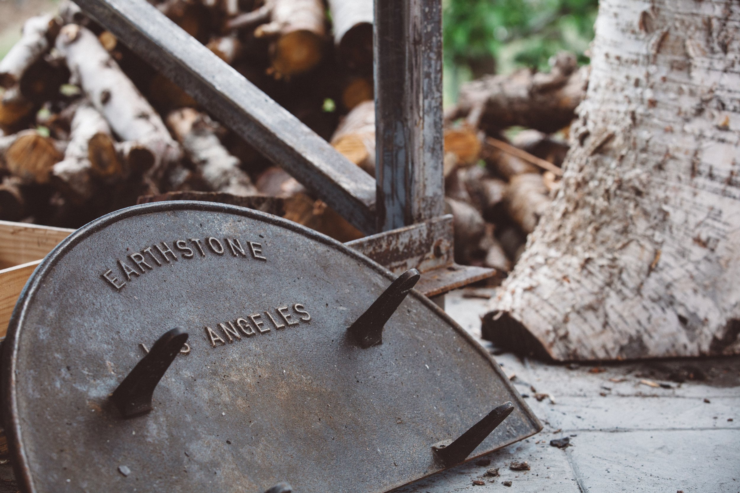
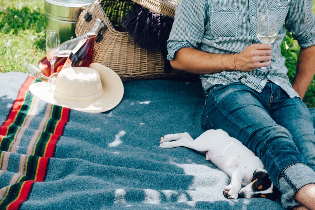
The outdoor “Picnique” area and its wood-burning oven creating a laid-back and convivial wine country space which was unique to to the area. Joie Picnique was an opportunity to offer a fresh experience and re-imagine the nature of the guest experience we were offering. It re-set the bar for winery visitors to the Naramata Bench from that summer onwards.
Inspired by European elements, the JoieFarm brand story referenced an old world aesthetic through its logo, wine labels and across all marketing.
The “new” Joie was wildly popular. In 2017 the old farmhouse was torn down and new purpose-built tasting room was constructed to better serve the new onslaught of guests.
From a branding perspective the enduring, European-meets-West-Coast, aesthetic of the new structure was irresistible. Its curated textural and rough-hewn material elements were juxtaposed by the modern, clean-lines of the building. The result evoked a relaxed, comfortable setting inspired by the nature that surrounded it.
The magical tension between old-world and new world of the wine making techniques were mirrored back through JoieFarm’s physical space. The new building and landscaping projected a sophisticated sense of taste in its simplicity, best enjoyed with feet in the grass.
For twenty years the brand employed a modern contrast of bold saturated colours in its typeface and branding.
Repeated use of nautical patterns, stripes, gingham, and those naturally found in woven fabric, evoked the west coast vibe along with a welcoming and familiar nostalgia in its photos, digital and social media presence. This allowed for a sophisticated communication of the winery’s core values.
The Joie brand of “European-inspired Wines for West Coast Living” came to be known for its consistency, premium quality, and accessible pricing. Joie’s service standard in sales and hospitality was world class and the brand was internationally recognized for its unwavering attention to detail.
“To create a thing of beauty, to inspire and remind oneself and others that beauty is all around us, if only we learn to see.”
- dale nigel goble
The JoieFarm logo artwork was created nearly 20 years ago by artist Dale Nigel Goble. Through the various changes within the winery, from production to market placement, the logo has stood the test of time.
Photo Credit - Nik West
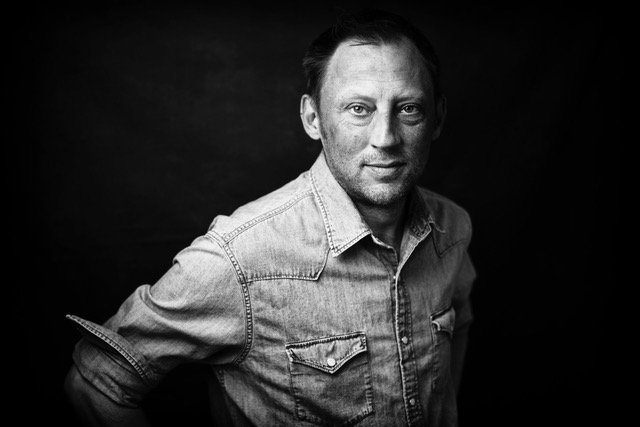
Dale Nigel Goble
Dale Nigel Goble was my friend and collaborator for 20 years. Dale was a vibrant graphic artist, printmaker, digital pioneer of website “look and feel” and prolific creative genius.
Dale’s aesthetic permeated everything I created at Joie and was instrumental in its branding from day one. His aesthetic deeply informed the way that I publicly presented myself for two decades. Dale was an integral part of my life’s special occasions as they unfolded: my first business card, wedding party invite, Christmas cards, my son’s birth announcement, my 40th birthday party invitation - he made every occasion a gorgeous and celebratory one.
It was a privilege to work with dngSTUDIO during his inexhaustible career.
Dale had a magical talent for taking my concepts and sketches (I used to fax him my poor drawings) -or even a snippet of a conversation - and creating from them an image that embodied the energy for what needed to be communicated. Dale took the actual “esprit” of my creative joie de vivre and gave it a corporeal form. We would finesse images and details until they were perfect projections of my vision.
Dale passed away in December 2019.
His art still graces the walls of my home, and his label art lives on in my cellar - the energy of which flies from the bottles whenever they are opened. I have deep gratitude for his understanding of my creative endeavours, his undying enthusiasm for my personal brand, his positivity and his creative genius. I would like to share some of our work and favourite projects here.
Special Labels
-
Every now and then I would make an off-brand wine that was outside the varietal core of the JoieFarm portfolio.
As the winery gained new vineyard sites, they would often come with tiny amounts of grape varieties that were outside of the focus of the winery. These creative opportunities were always exciting for me and I began to play around, learning to work with grapes like Syrah and Viognier, which were well outside of the delicate and nuanced characteristics of Burgundy and aromatics.
These small-production wines became cherished offerings to our best customers and eventually our wine club, honoured with specially created labels that Dale and I would dream up together. My favourite of these were a series of guided images inspired by Chinoiserie-style artworks. This inspiration came one night while eating and admiring the label of a single-origin chocolate bar. We took the dominate flavour profile of the each of the wines and gilded that characteristic on the labels, as you see in the honeysuckle, oyster and current images on the “Vive La Revolution” rosé label.
Eventually I created a side label called “Chic Fille” that was an R&D space for me to experiment, not only with new varietals, but with new techniques in the hopes of inevitably making the core Joie wines better.
Chic Fille colloquially means “cool” girl. Dale perfectly captured this cheeky spirit with my laughing, yet somehow, still chic-looking head-and-shoulders image.
Brand Story
-
JoieFarm as a brand was unconventional in many ways.
Joie was a gypsy winery for three vintages before it had its own winery building and vineyards. As self-taught winemakers, Joie made a name for itself with an unlikely, old-world proprietary white aromatic blend, a Burgundian country red blend and a rosé not very popular in the early 2000s yet and still referred to as blush in the Okanagan Valley.
Dale skilfully and stylishly helped us bring these underdog wines to the thirsty masses. All three of those “unlikely” characters became iconic BC wines embodying the freshness and intensity of fruit for which British Columbia has become renowned.
Marketing
-
Dale would often take ideas and initiatives throughout the year, actualize them to be irresistible calls to action with his signature, often cheeky bold graphic pop-art style.
From website design to newsletters, Christmas cards and wine releases, Dale made JoieFarm look good for 20 decades.


